Complementary
Two colors from opposite sides of the wheel. They make each other look more vivid, which is why the pairing is used for anything that needs to stand out.
Rebecca purple is the hex color #663399, with RGB values 102, 51, 153. It is a CSS color keyword, so browsers render it from the name alone, and its value is fixed by the CSS Color Module.
Every swatch on this page, as one image you can save or share.
Every value for #663399, ready to paste. Click any code to copy it.
| Channel | Decimal | Share | Hex | Octal | Binary |
|---|---|---|---|---|---|
| Red | 102 | 40% | 66 | 146 | 01100110 |
| Green | 51 | 20% | 33 | 63 | 00110011 |
| Blue | 153 | 60% | 99 | 231 | 10011001 |
The nearest web-safe color is #663399, from the 216-color palette browsers agreed on before displays could be trusted with more.
Every step is generated from #663399. Click a swatch to copy its hex.
A shade is the base color with black mixed in. Shades read as deeper and more dramatic, and they are what you reach for when a color needs to recede or carry weight.
A tint is the base color with white mixed in. Tints turn pastel as they lighten, which makes them useful for backgrounds and for anything that has to sit behind text.
A tone is the base color with gray mixed in. Tones lose the shout without losing the hue, and they are usually what separates a considered palette from a loud one.
The same color as the 50 to 950 ladder every CSS framework uses, with #663399 at 500. Click a step to copy its hex, or take the whole scale as variables for a design system.
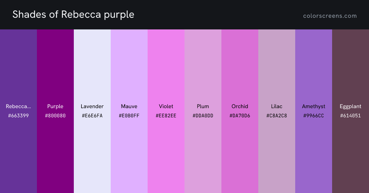
Rebecca purple sits in the purple family. Every named purple in the library, with rebecca purple first.
| Swatch | Name | Hex | RGB | HSL |
|---|---|---|---|---|
| is a CSS keyword is the color on this page | #663399 | 102, 51, 153 | 270, 50%, 40% | |
| Purple is a CSS keyword | #800080 | 128, 0, 128 | 300, 100%, 25% | |
| Lavender is a CSS keyword | #E6E6FA | 230, 230, 250 | 240, 67%, 94% | |
| Mauve | #E0B0FF | 224, 176, 255 | 276, 100%, 85% | |
| Violet is a CSS keyword | #EE82EE | 238, 130, 238 | 300, 76%, 72% | |
| Plum is a CSS keyword | #DDA0DD | 221, 160, 221 | 300, 47%, 75% | |
| Orchid is a CSS keyword | #DA70D6 | 218, 112, 214 | 302, 59%, 65% | |
| Lilac | #C8A2C8 | 200, 162, 200 | 300, 26%, 71% | |
| Amethyst | #9966CC | 153, 102, 204 | 270, 50%, 60% | |
| Eggplant | #614051 | 97, 64, 81 | 329, 20%, 32% | |
| Dark orchid is a CSS keyword | #9932CC | 153, 50, 204 | 280, 61%, 50% | |
| Thistle is a CSS keyword | #D8BFD8 | 216, 191, 216 | 300, 24%, 80% | |
| Dark violet is a CSS keyword | #9400D3 | 148, 0, 211 | 282, 100%, 41% | |
| Medium orchid is a CSS keyword | #BA55D3 | 186, 85, 211 | 288, 59%, 58% | |
| Medium purple is a CSS keyword | #9370DB | 147, 112, 219 | 260, 60%, 65% |
Harmonies are positions on the color wheel rather than matters of taste, which is why they keep working across very different designs.
Two colors from opposite sides of the wheel. They make each other look more vivid, which is why the pairing is used for anything that needs to stand out.
Three neighbors on the wheel. Nothing competes, so the result reads calm and settled, closer to how color behaves in nature.
The base plus the two colors either side of its complement. It keeps most of the contrast while being much easier to balance.
Three colors spaced evenly around the wheel. Strong and lively, and usually best with one dominant color and two accents.
Two complementary pairs, forming a rectangle on the wheel. The richest scheme available, and the hardest to keep from shouting.
One hue at different lightness levels. Effortlessly cohesive, and the safest way to build a palette around a brand color.
Near neighbors, for when this color is almost right. Each one shifts hue, saturation or lightness by a small step.
Five-color palettes built around #663399, each following a different scheme. Click any swatch to copy it, or open the generator to build your own.
Open the palette generator to lock the colors you like and regenerate the rest.
5 ready-made purple gradients, each with every stop written as a hex you can edit.
Whether rebecca purple works as text, and what to put on top of it when it is the background. Ratios follow WCAG 2.1, where 4.5 is the bar for body text and 3 for large text.
Large text at 24 pixels
Body text at 16 pixels. A flat field of color removes every variable, which is what makes it useful for judging a display.
Large text at 24 pixels
Body text at 16 pixels. A flat field of color removes every variable, which is what makes it useful for judging a display.
Used the other way round, #663399 as a background takes #FFFFFF text. That is the higher-contrast of the two, and it is what the tool picks automatically for any chrome sitting on your color.
Rebecca purple reads better on a white background of the two. Contrast is a property of the pair, not of one color, so a color that fails here can still be perfectly usable against a different partner.
The only keyword added since the set was inherited from X11 and SVG, standardised in 2014 in memory of Rebecca Alison Meyer, daughter of the web standards writer Eric Meyer, who died of a brain tumor on her sixth birthday. It carries white text at 8.4 to 1.