IBM brand colors
IBM does not give its logo a color so much as a token. The logo guidelines say the positive eight-bar mark is Black or Blue 60 and the reversed mark is White or Blue 50, and the values behind those names live in Carbon, the design system IBM publishes and builds its own products on. The result is a brand blue defined once and used everywhere, with no separate print specification: Carbon states no Pantone and no CMYK build.
Official site: carbondesignsystem.com
Palette image
Every swatch on this page, as one image you can save or share.
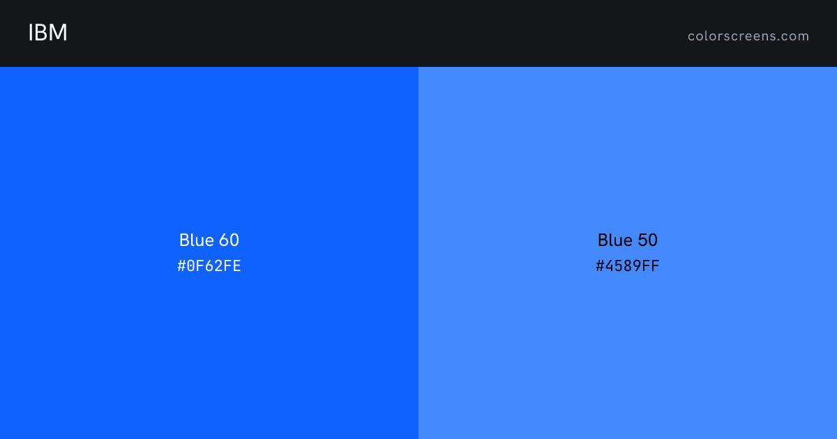
Every color
| Color | Role | Hex | RGB | HSL | Pantone | CMYK | Preview |
|---|---|---|---|---|---|---|---|
| Blue 60 | primary | #0F62FE | 15, 98, 254 | 219, 99%, 53% | -- | -- | Fill screen |
| Blue 50 | secondary | #4589FF | 69, 137, 255 | 218, 100%, 64% | -- | -- | Fill screen |
IBM against your project
Contrast pairs
Blue 60 passes AA for body text on white, at 5 to 1.
Of 12 ordered pairs in this palette, 6 clear 4.5 to 1 for body text and 10 clear 3 to 1 for large text. Row is the text color, column is the background.
| Text color | Blue 60 | Blue 50 | White | Black |
|---|---|---|---|---|
| Blue 60 | 1.5Blue 60 on Blue 50, fails AA for body text | 5.0Blue 60 on White, passes AA for body text | 4.2Blue 60 on Black, fails AA for body text | |
| Blue 50 | 1.5Blue 50 on Blue 60, fails AA for body text | 3.4Blue 50 on White, fails AA for body text | 6.3Blue 50 on Black, passes AA for body text | |
| White | 5.0White on Blue 60, passes AA for body text | 3.4White on Blue 50, fails AA for body text | 21.0White on Black, passes AA for body text | |
| Black | 4.2Black on Blue 60, fails AA for body text | 6.3Black on Blue 50, passes AA for body text | 21.0Black on White, passes AA for body text |
Sources
- Every color on this page: https://carbondesignsystem.com/elements/color/tokens/
Other technology
Share